Ice Chess

Faux Walls Pano

Selfie Reflecting

Neon Upgrade v1

Neon Upgrade v2
When I took the photos for this project, I was uncertain what the final product would be. I set out to capture interesting scenes and details around downtown Grand Rapids. Born and raised in Grand Rapids, I have spent a good chunk of my life visiting and hanging out downtown. With no idea of what the projects would be, I wandered downtown trying to capture as much as I could in an afternoon.
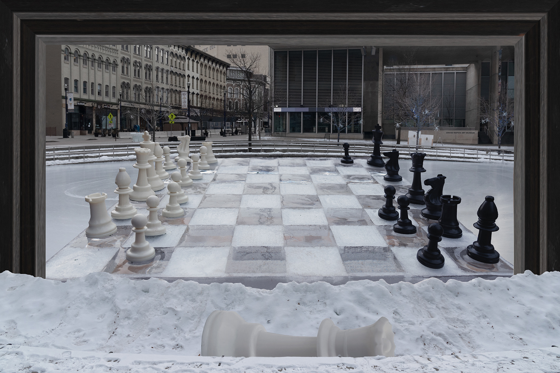
The first of four photoshop projects would be Illusion, taking inspiration from the works of Rene Magritte I set out to create an illusion that would warp reality. When I was a young child, downtown felt larger than life to me, I tried to recreate this feeling by creating a scene that felt larger than life itself. Using layers, perspective distortion, and forced perspective to build a scene that feels about as large on the outside as it does on the inside.
The second photoshop project, repetition, takes inspiration from Tom Bamberger’s impressive photo composite panoramas. I have been very passionate about panorama photography for a very long time and prior to this class I had never heard of Bamberger or his work. I have taken many panorama photos over the years, but I have never created one from a single image. What started as a photo shot vertically, using cloning & copying, extended outward and mirrored to create a towering wall stretching as far as the eye can see. For a bit of drama replaced the sky with something more interesting and bumped up the saturation to give the scene more life.
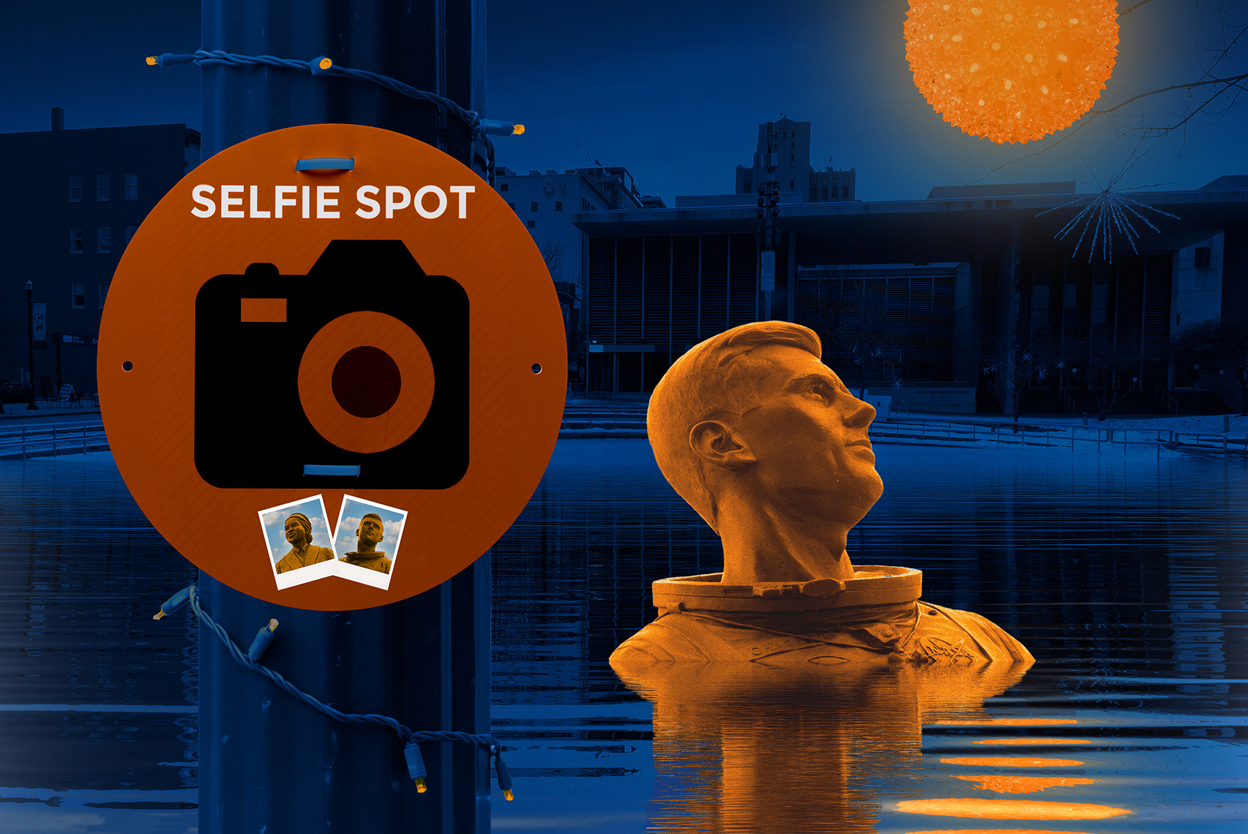
The third photoshop project, transformation, taking inspiration from Sandy Skoglund’s photos using contrasting color to blend reality with fantasy. This project probably took me longer to figure out than the rest. Starting with the museum background, shifting the color of the background to blue and toning the color to give the impression that it was photographed at night. The first contrasting piece added was the glowing ball which was changed to orange and given a glow. That was followed by the light post and sign, having also changed the colors to match the blue and orange theme of the image. Playing off the selfie sign, I created polaroid photos to coved unwanted text on the sign. To finish off the image I added a statue and a reflecting pool of water to give more depth and interest to the midground of the image.
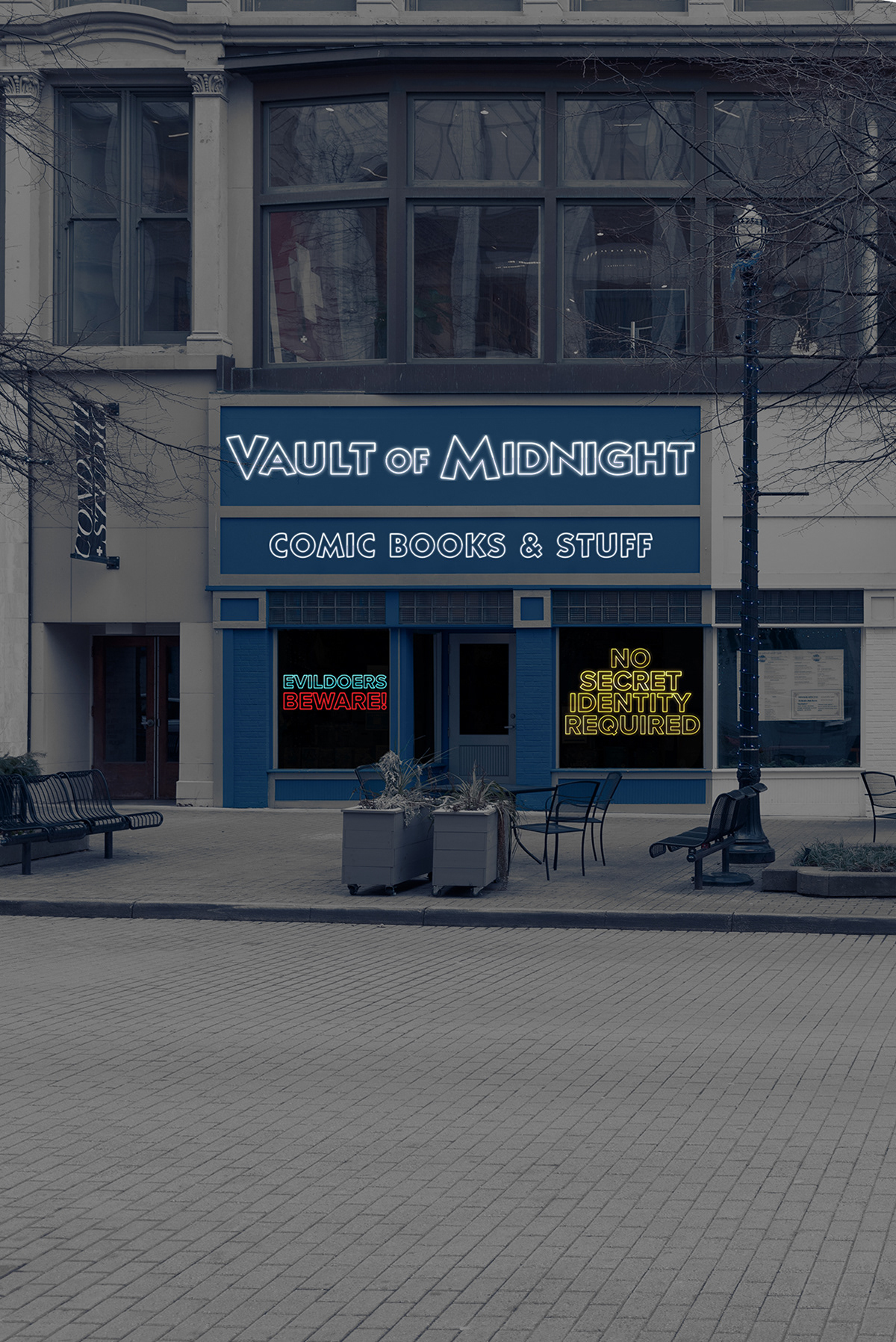
The fourth photoshop project, Revealing/concealment, inspired by Jenny Holzer & Barbara Kruger method for changing the meaning of a photo by adding text. Like my previous image, I used color grading to give the impression that the photo was taken later in the day. Masking out the windows with dark color to give the overall image more mystery. I am a huge fan of comic books and superheroes; I wanted to take this photo of my favorite local comic book shop and give it a glitzy neon makeover. Using blend modes and masks I was able to transform basic text into glowing neon outline to make the store look a bit flashier.